

Top Ten Covers I Wish I Could Redesign
1. The Fire Chronicle - James Stephens


I loved the first book in this trilogy's cover (image on the right), it screamed adventure and magic...this book, not so much. I actually got this out of the library today and was so disappointed to see that the characters had faces! It's not how I pictured them at all and they should've stuck to the pattern of the old cover, which just consisted of their silhouettes.
2. Heroes of Olympus: Mark of Athena - Rick Riordan


I love the other covers of these books, the hardback versions (one on the right), these paperback ones are...terrible. He looks green and like a zombie and Medusa (I presume) looks fake and her facial expression scares me. Definitely prefer the other cover.
3. 13 Little Blue Envelopes - Maureen Johnson
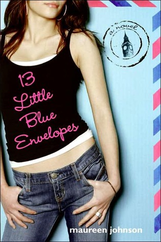
I really don't like this cover. It should've had more of a postcard effect to it. I don't think they should've put the cover model on.
4. Twenty Boy Summer - Sarah Ockler

The font is quite plain and I'm not a huge fan of the cover either. I haven't read this book yet, but the cover is a no-no for me. Perhaps if the font were different.
5. The Summer I Turned Pretty - Jenny Han

I really don't like this cover version, the cover models aren't how I imagined the characters to be at all, although I do like the sunset and the font, which screams summer!
6. Between the Lines - Jodi Piccoult


*sigh* These books do not look like they fit into the young adult genre AT ALL. When I first saw this around the blogosphere, I honestly thought it was a book for adults. It needs a new cover!
7. Stella Etc series - Karen McCombie

I'm not particularly sure what I don't like about this cover. It's pretty cute but the colours are a bit dull.
8. Scarlett - Cathy Cassidy


Okay, so these aren't the same book, but it's the same cover redesign. Cover models. I loved the previous covers for these! They were so pretty and artistic! These aren't bad but I'm not a fan of cover models.
9. The Power of Six - Pittacus Lore

I'm really not a fan of this cover. It doesn't make sense and it's too green. Other colours would have been nice as well as a picture that made sense.
10. The Way of the Warrior - Chris Bradford

All the covers seem quite similar to me and I also don't really like that silver bit at the top, it would've looked really nice it it were all red. I know they need it silver because of the red circle and the swords but they could've made a plan.